Directors Award “she” : a conversation with Lesley Nowlin Blessing
Lesley N Blessing was the recipient of our Director’s Award for her image, “Floating, Twin Elements,” in the “she” exhibition, juried by Sandra Chen Weinstein. Here is what Lesley has to say by way of introduction:
Photography has been in my life since I was young. Street photography, editorial, commercial, non-profit, documentary, lifestyle and fine art are fields I’ve explored. After owning a fine-art photography gallery for a brief moment I came to recognize my passion for art. Like most artists my desire is to create work that tells a story and evokes emotion. People, relationships, and nature are my inspiration as well as the print. I discovered the platinum print recently and have dedicated a large amount of time printing on vellum. It has been an awakening in my work that I was in search of and I look forward to discovering more alternative processes.”
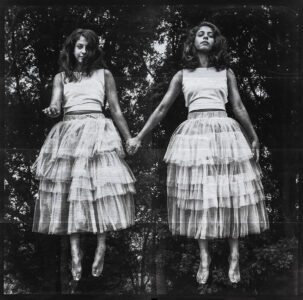
Her image, “Floating, Twin Elements” Is a wonderful example of creative alchemy. The disparate expressions on their faces — explaining two divergent personalities? The figures poised in midair – indicating the supernatural, unique place of twins in the world — objects of intense curiosity, exponentially more interesting, cuter than just one, and slightly mysterious. Folks generally love to tickle and bounce babies, twins even more so. I know, I came from a family of twins. Twinhood is much more nuanced and complicated than the two peas in a pod generalization. I think this image portrays that perfectly. The twins are printed in platinum palladium on vellum backed with silver leaf gilding. The effect if beautiful, outstanding.
Kevin: Lesley, your twin body of work is really wonderful. Can you tell us about your process of creating it technically, creatively and emotionally?
Lesley: First of all, thank you for all the very kind comments on my work! And for selecting my work, I’m honored. I’ll try my best to answer all of this!
My visual journey into twins started in 2003 when I selected a topic to photograph that was close to me. I am a twin and our relationship through the years has evolved. The project “Being a Twin” is a study on twins and their partnership as children. It was a project of nostalgia in missing the relationship I had with my own twin as kids; the uncompetitive nature, the laughing, every day activities, singing, eating, sleeping, watching tv, playing soccer and so much more. We were together, always together.
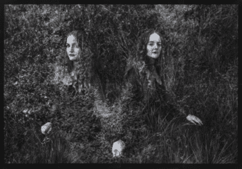
Change is inevitable in any relationship but as a twin the separation can be painful. Marriage, kids, moving across the country, other big life decisions, all of it has separated our friendship in ways that are difficult to understand. Around 2013 I started to create a photographic narrative showing our relationship as adults. Each art piece in Twin Elements illustrates some form of feeling or situation I’ve experienced.
After photographing twins in their natural setting for so long I craved something more extravagant, tangible and ethereal. I’m very influenced by the poses and mood of the Pre-Raphaelites and the romantic and ornate quality of the Art Nouveau period. I set out to create my own vision of our twin journey with twin models, nature, stylists, whimsy positions and completed with ornate detail.
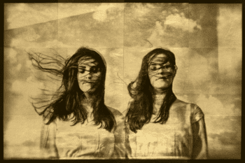
I really enjoyed photographing the twins, posing them, manipulating the scene to mimic my intended feeling. The technical side was a bit trickier. My background in printing is silver gelatin. Wanting to explore more I started playing around with a few alternative processes. I chose platinum palladium for its quality in detail and lush appearance.
Transparency gave me the chance to incorporate texture and depth. I chose to print on vellum for its durability in the water and that led me to experiment with gold, copper and silver leaf as texture and shimmer. The size of each piece is determined how best it will look large and divided. I create a digital negative of each section, print, gild, varnish and then put the image back together. For me, the physical result is like a metaphor for our relationship…rich, complex, and no one person is the same.
Kevin: Lesley, I know as an artist that certain projects evolve with the time spent in creation. As a painter I never end up as I began. Very simply, the time it takes to apply paint or achieve whatever technique gives one additional time to reflect on the process and the concept. Has the act of leafing and working with the platinum palladium caused you to move in a direction not originally envisioned?
Lesley: Definitely, I’d say every stage has brought some sort of shift in plan but the platinum on vellum is what changed things the most. Because vellum has such a lovely transparency I was able to play with texture within the print and composition itself. At the very beginning of this project my first completed piece was a messy version of my final techniques for the series. I really love Harry Callahan and his work inspired the double exposure but I realized I could control this in the darkroom rather than in the camera. After experimenting with platinum on velum enough to understand the results I decided to merge the negatives in the printing stage instead of trying to manipulate the photoshoot and scene with the twins. I wanted it to be less literal, with some narrative detail but more natural and whimsical.
Kevin: Lesley you mention Harry Callahan. I think what gives much of his black and white work such immediacy is his use of contrast and black as an element of an image. I see this in your image “Floating.” Was that a conscious choice. Unfortunately, those viewing it online won’t get the full effect, but in person the wonderful silver leaf gilding both tempers and accentuates the effect.
Lesley: Yes, as a young photographer I loved high contrast in all my work, it was a bit much to be honest. I blew a lot of the detail out of the shadows and highlights.
The drama of the contrast in Twin Elements is something I aimed for especially in the printing stage. “Floating” is actually a straight single image with no double exposure or second negative. I photographed it in front of the trees because I wanted the girls to pop off the print. The contrast is definitely how I did it. At this point in shooting and printing I knew what would work and what wouldn’t. Sometimes I think my idea will be great and it just doesn’t print well. Each piece takes me a long time to put together. I have a million test prints b/c I tend to be a perfectionist. If the contrast isn’t right I’ll do it again until it is.
And yes, I agree with you. My work is best seen in person. The iridescent affect of the leaf that each piece has against the Pl/Pd and contrast has almost a three dimensional feel. You can see the pieces from different points of view and see unique detail that you couldn’t before.
I’m aiming to finish this project in the next few months. Thank you for asking me all of these questions about my work. It’s been interesting to think about why I do what I do.
Kevin: Lesley thank you very much for taking the time to do this. We look forward to seeing where you go next.
To see more of Lesley’s work, follow this link.